BUOY
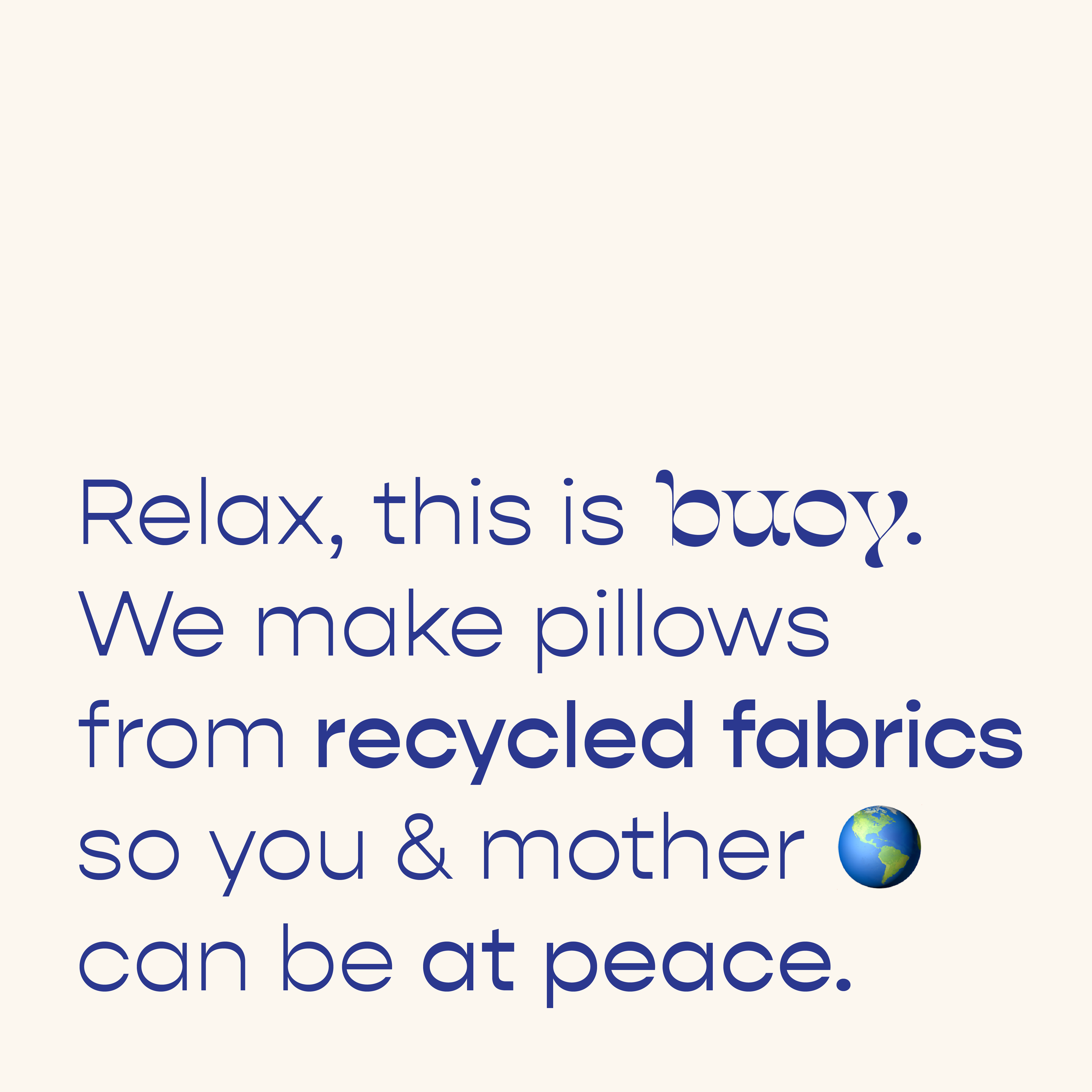
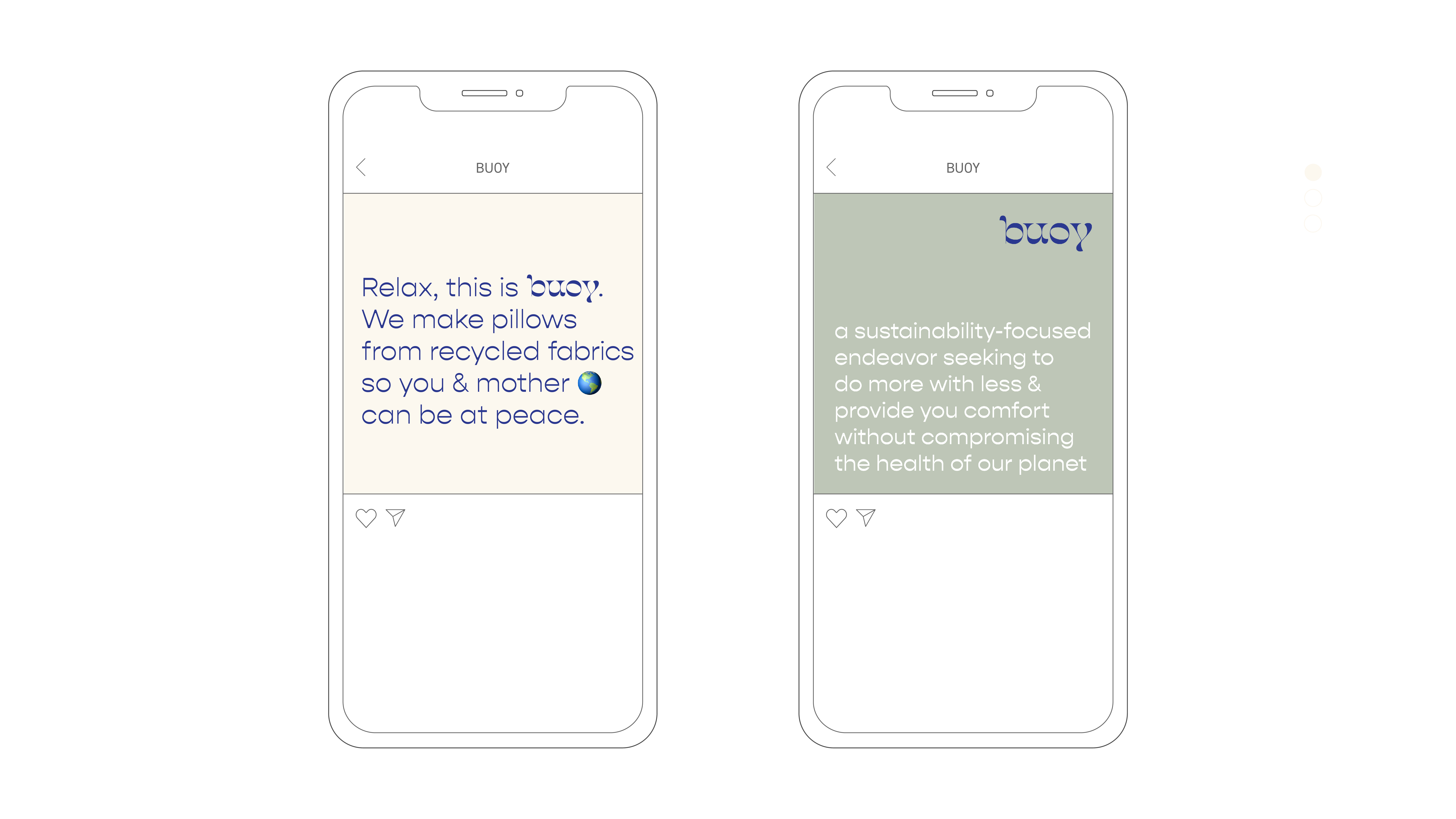
INFO I developed the brand identity for buoy, a sustainable eco-friendly pillow company.

While developing the look and feel, I focused on the sturdy yet floating qualities of buoys and the leaning and pressing nature of how bodies touch and interact with cushions.
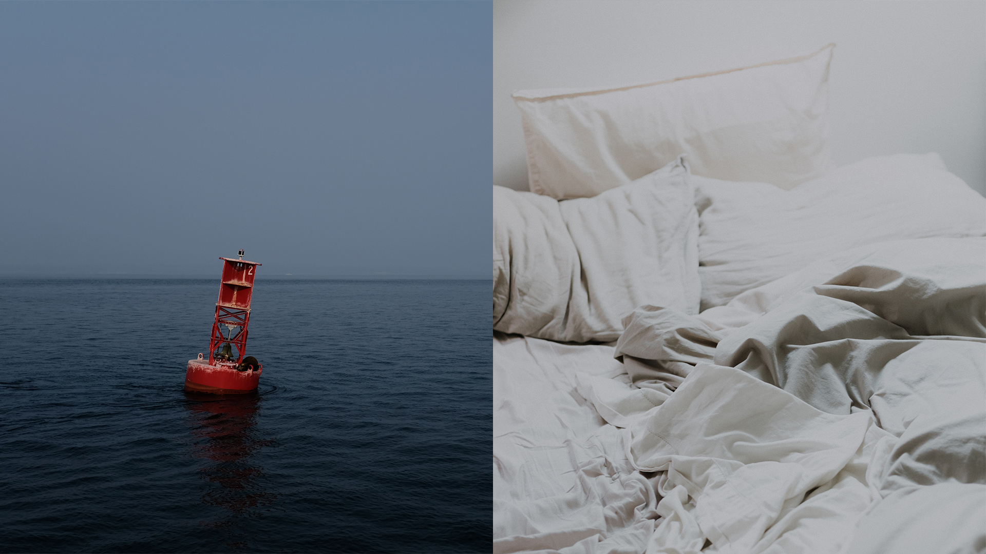
The beauty and materiality of a pillow is in how it receives the human form.
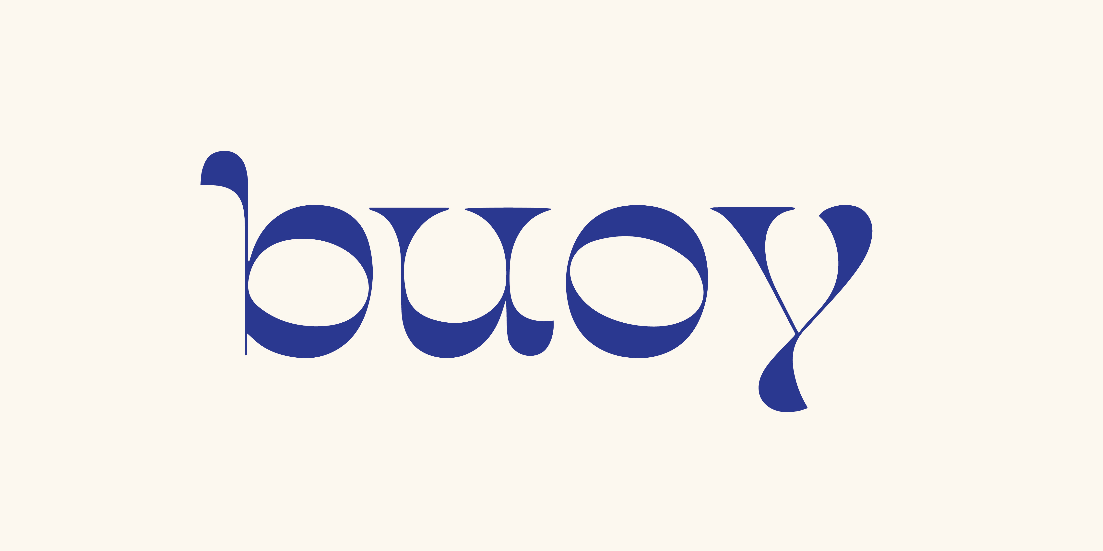
In the brand’s logo I wanted the type to mimic the feeling of leaning that evokes a sense of touch and tactility, without any of the forms overlapping or making contact.
The client originally wanted a very thin and modern logo with a clean and minimal overall brand identity. However with the company existing in the textile and bedding space, I proposed moving towards thicker, juicier letterforms that echo the physicality of cloth, something a person would want to touch and squeeze.